
Modern Web Weekly #57
The modern web, tested and explained in plain English

The horror of PWA splash screens on iPadOS
When you build a PWA for iOS or iPadOS, you will need to provide so-called splash screen images. This is the image that is displayed while the app is starting up.
Usually, this will be the logo of the app, centered on the screen, but you can really use any kind of image you want.
On Android, splash screens are generated for you using one of the icons you provide in manifest.json, usually the 512x512px one.
On iOS and iPadOS, you will need to provide splash screen images for the device using a <link> tag with a media query that targets the user’s device. You will need to provide a separate image for each iOS or iPadOS device with certain dimensions, so the list can become quite long.
I was recently alerted to a tool that generates them on the fly for you. The benefit of this tool is that it generates the needed <link> tags based on the screen dimensions, so theoretically, you should always have the correct tags instead of a hard-coded list that may become out of date quickly.
As an example, here are the <link> tags that you would need for an iPad Pro 11”:
<link rel="apple-touch-startup-image" href="portrait.png"
  media="(device-width: 834px) and (device-height: 1210px) and
         (-webkit-device-pixel-ratio: 2) and (orientation: portrait)">

<link rel="apple-touch-startup-image" href="landscape.png"
  media="(device-width: 1210px) and (device-height: 834px) and
         (-webkit-device-pixel-ratio: 2) and (orientation: landscape)">
There are two images, one for portrait mode and one for landscape mode. The splash screen is selected based on the given media query in the media attribute. If the device matches the media query, the image listed in the href attribute will be displayed as the splash screen.
Since there are many different iOS and iPadOS devices, the list can become quite long and you would have to consult the Apple Human Interface Guidelines to get the complete list of devices, which can become unwieldy quickly.
I would advise you to use a tool like pwa-asset-generator to generate the list of <link>tags for you, or use the tool that adds them on the fly, like I mentioned earlier.
While testing, however, I noticed some issues.
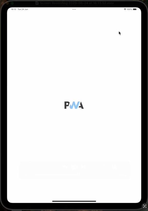
The splash screen for portrait mode works fine:
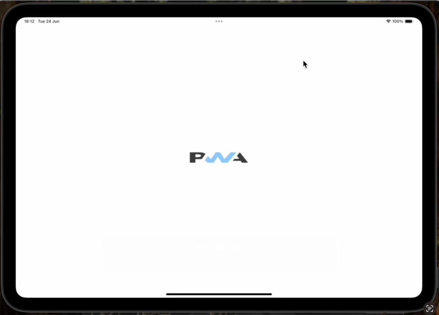
However, when I start the app in landscape mode, the splash screen looks squished:
After asserting that the images used for both modes were correct, I started checking the logic that was used for generating the splash screens and the <link> tags, which is the iOSPWASplash tool.
The images and <link> tags are generated based on the screen dimensions reported by screen.width and screen.height. In addition, I checked window.orientation to establish the orientation of the device.
To my surprise, the iPad Pro 11” reported the same values for screen.width and screen.height in both portrait and landscape mode, whereas I expected them to be swapped in landscape mode. Conversely, window.orientation did change its value based on the orientation of the device.
<link rel="apple-touch-startup-image" href="portrait.png"
      media="(device-width: 834px) and (device-height: 1210px) and
      (-webkit-device-pixel-ratio: 2) and (orientation: portrait)">

<link rel="apple-touch-startup-image" href="portrait.png"
      media="(device-width: 834px) and (device-height: 1210px) and
      (-webkit-device-pixel-ratio: 2) and (orientation: landscape)">
This led me to believe I needed to specify the same width and height for landscape mode instead of swapping them. However, in landscape mode, the splash screen was still squished.
As an experiment, I removed the <link> tag for portrait mode and installed the app while in landscape mode to see what would happen.
To my surprise, there was no longer any splash screen at all!
It seemed that when installing the app, the <link> tag for landscape mode is ignored and the one for portrait is used.
Ok, let’s then only use the <link> tag for portrait but give it a different image based on the device orientation:
const splashImage = deviceOrientation === 'portrait' ? 'portrait.png' :
                    'landscape.png';

document.head.insertAdjacentHTML('beforeend', `
      <link rel="apple-touch-startup-image"
        media="screen and (device-width: ${screen.width}px) and
        (device-height: ${screen.height}px) and
        (-webkit-device-pixel-ratio: ${pixelRatio}) and
        (orientation: portrait)"
         href="${splashImage}">`);
Unfortunately, the splash screen would still be displayed squished in landscape mode.
At this point, I decided to draw the icon for the splash screen at double the height so that when it’s squished to half its height, it would look correct again.
No luck.
What was going on?
As a last resort, I made the image for landscape mode the same dimensions as portrait, but still with the icon drawn at twice its height.
And lo and behold, the splash screen was finally correct!
Until I checked in portrait mode, the icon was stretched…
AAAARGHHH!!!
Conclusion
After extensive testing, I came to the following conclusion:
When the app is installed on iOS or iPadOS, the <link> tag with the correct media query for portrait is used, and the one for landscape is ignored.
This is because the screen.width and screen.height properties report the same values, regardless of the orientation of the device.
This means that the splash screen for portrait is used for both portrait and landscape and therefore, the image is squished in landscape mode.
And right now, there’s nothing you can do about it.
This seems to be hardcoded or downright incorrect behavior on iOS and iPadOS.
I will submit a bug for this to the WebKit team. To be continued…
Modern Web Weekly Chat
The Modern Web Weekly chat is now available for all subscribers, a community where you can engage, ask questions, and have direct access to me.
I will try to answer your questions and occasionally post videos and podcasts to address questions directly.
Join here:

sibling-index() and sibling-count() in Chrome 138
Have you ever wanted to style an element based on its DOM position relative to its siblings or based on the total number of siblings?
sibling-index() and sibling-count() now allow you to do exactly that in Chrome 138.
An obvious use case for this is a staggering animation where a group of HTML elements gets an increasing transition-delay based on their position in the DOM tree, i.e., each subsequent element gets a longer delay, so you end up with a nice animation like this.
Before, you would have to hard-code the delay based on the position of the element:
li:nth-child(1) {
  transition-delay: 10ms;
}

li:nth-child(2) {
  transition-delay: 20ms;
}

li:nth-child(3) {
  transition-delay: 30ms;
}

...
Of course, this doesn’t scale as you would need to update the CSS every time a new element is added.
With sibling-index(), this becomes a breeze:
li {
  transition-delay: calc(sibling-index() * 10ms);
}
sibling-index() returns the index of the element relative to its siblings, starting with 1. So the first element gets a transition-delay of 10ms, the second 20ms, and so on.
The sibling-count() function returns the total number of siblings. This is something you could use to create a radial menu where sibling-count() and sibling-index() are used to calculate the rotation angle of each item.
sibling-count() is used to divide the circle (360 degrees) by the number of items, and then this value is multiplied by sibling-index() to get the correct angle for that item.
Here’s a codepen that demonstrates this with 9 items:

And here’s a codepen that lets you change the number of items with a slider:
PWA Audit: on your way to a great PWA
Do you already have a PWA, but are you running into issues with performance, security, or functionality? Or are you not sure how to make your PWA better?
I can help you by running an audit of your PWA
I will evaluate it on more than 35 criteria and provide you with clear and actionable instructions on how to improve it. No generic stuff that you can get anywhere, but an in-depth quality checkup to get you on your way to a great PWA.
Some of the criteria I will evaluate it on are:
Installability
Cross-device and cross-platform compatibility
Offline support
Usability
Effective use of modern web APIs
Performance
Security
Your investment in the improvement of your PWA through the audit is €599 excluding VAT (where applicable).
If you want to request an audit or first would like to know more, you can
fill out the form or book a call with me.
