

Modern Web Weekly #56
The modern web, tested and explained in plain English

Modern Web Weekly chat is now available 🎉
If you’re a paid subscriber, you now have access to the Modern Web Weekly chat.
This is a conversation space exclusively for paid subscribers—kind of like a group chat or live hangout. I’ll post questions and updates that come my way, and you can jump into the discussion.
I will do my best to answer all your questions, and occasionally I’ll post a video or podcast to address your questions directly.
A responsive menu with anchor positioning
Anchor positioning is slowly revolutionizing web design. In essence, it’s a simple API that enables you to tether HTML elements together, but it allows you to implement some very interesting layouts.
To recap, anchor position works by giving the element that will serve as the anchor the CSS property anchor-name. Its value is a dashed-ident name that starts with a double dash, just like a CSS custom property:
#anchor {
  anchor-name: --my-anchor;
}
The element that will be anchored to this element gets the CSS property position-anchor, and its value will be the same as anchor-name:
#anchored-element {
  position-anchor: --my-anchor;
}
The elements are now tethered together, and you can position the anchored element by absolutely positioning it relative to the anchor with the anchor() function:
#anchored-element {
  position-anchor: --my-anchor;
  position: absolute;
  top: anchor(bottom);
  left: anchor(left);
}
The top side of the anchored element is now positioned at the bottom side of the anchor, and its left side is positioned to the left side of the anchor.
You can anchor an element to different anchors, and you can do so by specifying the anchor in the anchor() function. The following is identical to the previous example:
#anchored-element {
  position: absolute;
  top: anchor(--my-anchor bottom);
  left: anchor(--my-anchor left);
}
Instead of defining the anchor with position-anchor, it’s now specified in the anchor() function.
The killer feature of anchor positioning is that you can define fallback positions that can be used when the anchored element would be displayed (partially) outside the viewport.
In the previous example, the anchored element is displayed below the anchor, but if there isn't enough space to display the anchored element inside the viewport, you can define a fallback position that displays it above the anchor.
Fallback positions are defined inside a @position-try block. To display the element above the anchor:
@position-try --above-anchor {
  top: unset;
  bottom: anchor(top);
}
The top value is reset, and the bottom of the anchored element is anchored to the top of the anchor. We define this position as a possible fallback position with position-try-fallbacks:
#anchored-element {
  position-anchor: --my-anchor;
  position: absolute;
  top: anchor(bottom);
  left: anchor(left);
  position-try-fallbacks: --above-anchor;
}
This way, you can define multiple fallback positions and define them on the anchored element as a comma-separated list:
position-try-fallbacks: --above-anchor, --left, --right;The browser will now select the best position to make sure the anchored element is always displayed inside the viewport.
An adaptive multi-level menu with anchor positioning
A client asked me to build a vertical menu with fly-out submenus that should be positioned on the right of the main menu. Since the submenus can become quite long, they should be repositioned to make sure they are always fully visible inside the viewport.
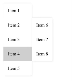
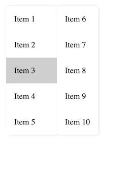
When there is enough space for the submenu, it should be displayed to the right of the main menu item, with the top of the submenu aligned to the top of the menu item:
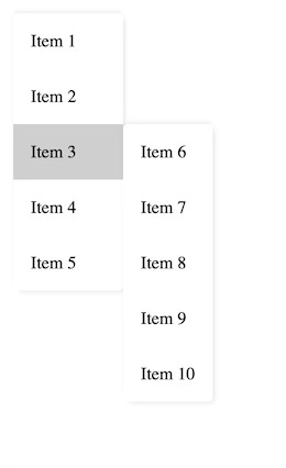
When there isn’t enough space to display the submenu, it should be aligned with the bottom of the main menu item:
When there isn’t enough space to display the submenu, it should be aligned with the top of the main menu:
If there still isn’t enough space to display the submenu, it should stretch to the full height of the viewport, and its content should be scrollable:
So, how to implement this with anchor positioning?
Let’s look at the three scenarios.
Main menu with submenu displayed on the right, top-aligned with the menu item
This is the simplest one, we simply position the submenu to the right of the main menu item, aligned with its top:
li.menu-item {
  anchor-name: --menu-item;

.submenu {
  position-anchor: --menu-item;
  top: anchor(top);
  left: anchor(right);
}
Main menu with submenu displayed on the right, bottom-aligned with the menu item
Here, we align the submenu with the bottom of the menu item instead of its top with a fallback position:
.submenu {
  position-anchor: --menu-item;
  top: anchor(top);
  left: anchor(right);
  position-try-fallbacks: --to-bottom;
}

@position-try --to-bottom {
  top: unset;
  bottom: anchor(bottom);
}
Notice that we need to reset top by giving it the value “unset”. While this is not a huge deal, it can become annoying if we continuously need to reset properties and error-prone whenever we forget to do this.
Luckily, there is an alternative and better way to position anchored elements with position-area. This property enables an anchored element to be positioned relative to the edges of its anchor by placing the anchored element on one or more tiles of an implicit 3x3 grid, where the anchor is the center cell.
Take a look at the Anchor Tool to understand how position-area enables you to position an anchored element with a single property so you don’t need to reset any other properties anymore.
I also explained this in detail in Modern Web Weekly #27. Notice that the property was called inset-area at the time.
To position the submenu to the right of the menu item, aligned with its top:
.submenu {
  position-anchor: --menu-item;
  position-area: right span-bottom;
  position-try-fallbacks: --to-bottom;
}

@position-try --to-bottom {
  position-area: right span-top;
}
We have now defined the default and fallback positions with a single position-area property.
Main menu with submenu displayed on the right, top-aligned with the main menu
To align the submenu with the top of the main menu, we can use the same position-area with the value “right span-bottom” but now instead of the —menu-item anchor, we should use the main menu as our anchor.
We can do this by giving the main menu an anchor-name and use that as the position-anchor in the fallback position:
.main-menu {
  anchor-name: --main-menu;
}

.submenu {
  position-anchor: --menu-item;
  position-area: right span-bottom;
  position-try-fallbacks: --to-bottom, --to-main-menu;
}

@position-try --to-main-menu {
  position-anchor: --main-menu;
  position-area: right span-bottom;
}
Main menu with submenu displayed on the right, top-aligned with the main menu and scrollable content
The last scenario is when the submenu is top-aligned with the main menu but it’s still too long to display fully in the viewport. In this case, the submenu should be scrollable.
Let’s see how we can implement this.
We need to make sure that the submenu will stretch to the full height of the viewport but not more than that and then its content should be scrollable.
We can do this by simply giving it a max-height and set its overflow property:
.submenu {
  max-height: 100vh;
  overflow: auto;
}
Now, the submenu will be top-aligned with the main menu, will stretch to the full height of the viewport and its content is scrollable.
It’s important to adjust the value of max-height accordingly if the submenu is displayed inside another element that doesn’t have the same height as the viewport, otherwise this fallback position won’t work and the browser will pick the default position.
Also, if the <body> element has padding or margin, you need to take that in account as well for this to work. For example, if the <body> element has a top margin of 8px and the submenu should stretch to the full height of the viewport, you need to subtract this from max-height:
.submenu {
  max-height: calc(100vh - 8px);
  overflow: auto;
}
Check the codepen below to see the menu in action:

PWA Audit: on your way to a great PWA
Do you already have a PWA, but are you running into issues with performance, security, or functionality? Or are you not sure how to make your PWA better?
I can help you by running an audit of your PWA
I will evaluate it on more than 35 criteria and provide you with clear and actionable instructions on how to improve it. No generic stuff that you can get anywhere, but an in-depth quality checkup to get you on your way to a great PWA.
Some of the criteria I will evaluate it on are:
Installability
Cross-device and cross-platform compatibility
Offline support
Usability
Effective use of modern web APIs
Performance
Security
Your investment in the improvement of your PWA through the audit is €599 excluding VAT (where applicable).
If you want to request an audit or first would like to know more, you can
fill out the form or book a call with me.
