


Modern Web Weekly #52
The modern web, tested and explain in plain English

Why you should use flexbox with view transitions (or grid)
Here’s an interesting issue I ran into last week while trying to improve an old view transitions demo.
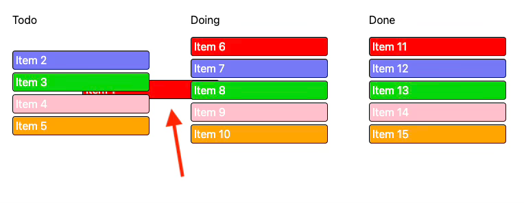
The demo shows how you can use view transitions when moving items from a “todo” list to a “doing” and “done” list. Here’s what it looks like:
I happened to notice that the item that was moved was actually moving behind the lists, which is not what I wanted:
Since this was an issue I had run into before, I knew the solution was to simply add a higher z-index to the moved item. The simplest way to do that is to add a class to the moved item that gives it z-index: 1 and then remove it when the transition is finished:
li.classList.add('active');

const transition =  document.startViewTransition(move);
await transition.finished;

li.classList.remove('active');
But to my surprise, this didn’t work because the <li> element had position: static.
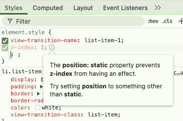
Now I’m aware that setting a z-index on an element with position: static has no effect, but I was surprised because I applied this fix before, and it always seemed to work while I was sure I never had to apply a value for position other than static.
I checked some of my other demos and noticed that the only difference with elements where this fix worked was that they had display: flex.
It turns out that flex elements create a stacking context when given a z-index with a value other than auto, even when they have position: static. Grid elements have this same behavior. I wasn’t even aware of this, but it always worked for me since I use Flexbox a lot.
When you create animations with view transitions, you will regularly have to modify the stacking order of elements to make them move in front of or behind each other, so always use Flexbox or Grid so you can apply a z-index.
In my case, I had to set display: flex and flex-direction: column on the parent <ul> element to make sure the items were still displayed vertically.
If you’re interested, this behavior is mentioned in the Flexbox specs and Grid layout specs.
Check the codepen demo.
The weird behaviour of PWAs installed through Firefox on Android
When you install a PWA on Android with a browser other than Chrome, what you effectively end up with is just a shortcut and not a “real” PWA. It will function as a PWA, but there are some differences when it’s installed through Chrome.
For example, a PWA installed through Chrome can capture links so when you click a link inside the scope of the PWA in an email, the PWA will be opened and not the default browser.
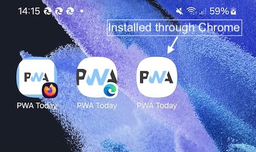
Another difference is that an icon of the installing browser will be shown on top of the app icon when it’s installed:
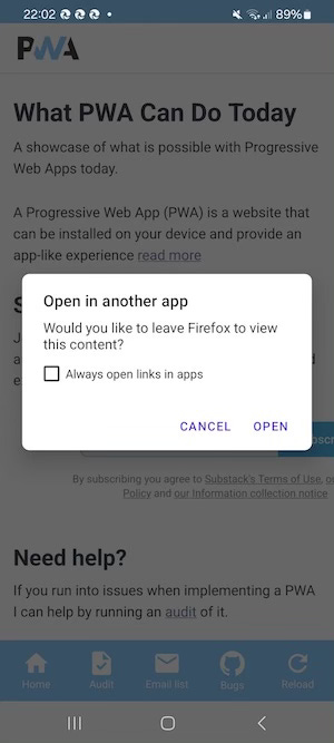
I noticed some other strange behaviour of PWAs installed through Firefox. When the same PWA is also installed through Chrome on the same device and the Firefox PWA is opened, it will offer to open the Chrome PWA instead:
This behaviour makes sense in a way because technically, the PWA installed through Firefox is a shortcut, and the PWA installed through Chrome captures the link.
But the PWA installed through Edge does not do this, so it’s Firefox-specific. It occurs on Android 15 and below. If this changes in the future, you will read about it here.
PWA Audit: on your way to a great PWA
Do you already have a PWA, but are you running into issues with performance, security, or functionality? Or are you not sure how to make your PWA better?
I can help you by running an audit of your PWA
I will evaluate it on more than 35 criteria and provide you with clear and actionable instructions on how to improve it. No generic stuff that you can get anywhere, but an in-depth quality checkup to get you on your way to a great PWA.
Some of the criteria I will evaluate it on are:
Installability
Cross-device and cross-platform compatibility
Offline support
Usability
Effective use of modern web APIs
Performance
Security
Your investment in the improvement of your PWA through the audit is €599 excluding VAT (where applicable).
If you want to request an audit or first would like to know more, you can
fill out the form or book a call with me.

Why didn’t I think of this?
If you’ve been working in web development for a while, you’ve undoubtedly had to set a z-index on an element with a value higher than 1. You may even have had to set z-index: 99999 on an element to make sure it’s always on top of everything, only to find another element with exactly that same value…
I saw a nice solution on the blog of Manuel Matuzović:
z-index: calc(infinity);Here, infinity is a keyword for the largest possible value (which is 2147483646 by the way). You can use this if you don’t want to worry about setting a very specific number. This will make sure it will be placed above any other z-index value, unless of course there is another element that also uses this and that is defined later in the CSS.
Nevertheless, nice solution!
How to make cross-document view transitions fast: part 1
Chrome, Edge, and Safari now support cross-document view transitions, which means view transitions between two separate HTML documents on the same domain. This enables nice transitions, for example, between a list and a detail page, as you can see in the screen recording below:
This is a transition between two entirely separate HTML pages that requires only CSS and a touch of JavaScript. By giving the cells in the selected row and the column headers the same view-transition-name as the labels and inputs in the form, the browser automatically animates the change in position between all elements that share the same view-transition-name.
Let’s break down the CSS that we need.
First of all, we need to opt-in to cross-document view transitions and we do that by adding this to the CSS:
@view-transition {
  navigation: auto;
}
This signals to the browser that it should animate the transitions between pages. If you don’t do any further customization, you’ll get a fading transition between the pages.
Now we give a unique view-transition-name to each column in the row that’s selected when it’s clicked. We add the class “active-row” to the row when it’s clicked and then assign the view-transition-name to each cell:
tbody tr.active-row {
  td:nth-of-type(1) {
    view-transition-name: name;
  }
  td:nth-of-type(2) {
    view-transition-name: age;
  }
  td:nth-of-type(3) {
    view-transition-name: address;
  }
  td:nth-of-type(4) {
    view-transition-name: city;
  }
  td:nth-of-type(5) {
    view-transition-name: country;
  }
}
To make sure each cell transitions into the corresponding input field in the form, we assign the same view-transition-name to the input fields. These fields all have an id that we use:
#name {
  view-transition-name: name;
}
#age {
  view-transition-name: age;
}
#address {
  view-transition-name: address;
}
#city {
  view-transition-name: city;
}
#country {
  view-transition-name: country;
}
Now we assign the same view-transition-name to the table headers and the <label> elements in the form. We select the headers by their class and the labels by their for attributes:
.label-name,
[for="name"] {
  view-transition-name: label-name;
}
.label-age,
[for="age"] {
  view-transition-name: label-age;
}
.label-address,
[for="address"] {
  view-transition-name: label-address;
}
.label-city,
[for="city"] {
  view-transition-name: label-city;
}
.label-country,
[for="country"] {
  view-transition-name: label-country;
}
We now already have a working transition, but there are some issues. You’ll notice that the cells and labels don’t consistently transition into each other and seem to break out of their boxes:
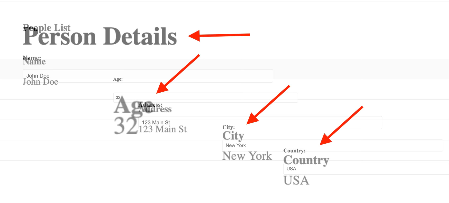
This is because the elements have different aspect ratios, but we can easily fix that with this CSS, which will keep the sizes of the elements consistent:
::view-transition-old(*),
::view-transition-new(*) {
  width: fit-content;
  height: 100%;
}
Another issue is that the other rows are also visible during the transition which makes it look messy and unclear. We want to fade out the other rows as soon as possible when the transition starts.
But to do that, we need to apply a fade to the ::view-transition-group pseudo-element that represents each row except the selected row to fade it out, each time a row is clicked. Since we don’t always know how many rows we have in total, this can become messy quite quickly.
Luckily, we can use view-transition-class to apply CSS to the ::view-transition-group pseudo-element of each row all at once:
table:has(.active-row) tbody tr:not(.active-row) {
  view-transition-class: inactive-row;
}
This specifies that the view-transition-class “inactive-row” will be added to each row that does not have the class “active-row” when the table also has an element with the class “active-row”. In other words, only when one of the rows is selected and it gets the class “active-row”, this view-transition-class is applied to the remaining rows.
The fade-out is then applied by using this view-transition-class as the selector:
&::view-transition-group(.inactive-row) {
  animation-name: fade-out;
  animation-duration: 0.1s;
}
To make sure this view-transition-class has any effect, the rows do need to have a unique view-transition-name as well, so it seems like we’re back to square one as now we need to define them individually, and we don’t know how many rows we have.
Luckily, Chrome Canary and Safari now support view-transition-name: auto, which automatically adds a unique view-transition-name. In the current stable Chrome, we can use the attr() function to use the id of the row as the view-transition-name:
tbody tr {
  view-transition-name: auto;
  view-transition-name: attr(id type(<custom-ident>), none);
}
Separate transitions for forward and backward navigation
In the same way, we also want the input and labels to transition back into the row in the list when we navigate back to it. The inputs and labels have a fixed view-transition-name but when we navigate back, we need to identify the row that was selected and apply the correct view-transition-name back to each cell, so the transition also works when navigating back. We also want the other rows to stay hidden until the transition of the other elements is finished.
To implement separate transitions based on the navigation direction, we need view transition types.
We can apply a view transition type using the pageswap and pagereveal events.
The
pageswapevent fires before the last frame of a page is rendered. You can use this to do some last-minute changes on the outgoing page, right before the old snapshots get taken.The
pagerevealevent fires on a page after it has been initialized or reactivated but before the first rendering opportunity. With it, you can customize the new page before the new snapshots get taken.
Since we need to apply the “active-row” class back to the selected row when we navigate back from the form to the list, we only need the pagereveal event.
In the event handler for this event, we inspect the current URL. If it’s index.html, we know we’re navigating to the form, so the navigation is forward and otherwise we navigate back to the list, so it’s backwards. We define the corresponding view transiton types “forward” and “back”. The pagereveal event has a viewTransition property that in turn has a types property that we can add the view transition type to.
The detail pages all have the id of the selected row in the URL, for example, detail-1.html, detail-2.html, etc. Right before we navigate back to the list, we grab the id from the URL and use that to select the correct row in the list page.
We then add the class “active-row” to it so all cells in it get the correct view-transition-name and when the transition is finished, we remove it again.
Here’s the complete event handler:
window.addEventListener("pagereveal", async (e) => {
  if(e.viewTransition) {

    // get the pathname of the current URL
    const path = new URL(location.href).pathname;

    // determine the navigation direction based on
    // the current URL
    const direction = path === '/index.html' ? 'back' : 'forward';

    // apply the view transition type
    e.viewTransition.types.add(direction);

    if(direction === 'back') {

      // parse the URL of the current page to get
      // the id of the selected row
      const fromPath = new URL(navigation.activation.from.url).pathname;
      const match = fromPath.match('\/detail\-([1-9])\.html');
      const id = match ? match[1] : null;

      if(id) {

        // get the selected row in the list
        const row = document.querySelector(`tbody tr:nth-of-type(${id})`);

        // apply the correct class
        row.classList.add('active-row');

        // wait for the transition to finish
        await e.viewTransition.finished;

        // remove the class
        row.classList.remove('active-row');
      }
    }
  }
});
The last thing we need to do is specify the CSS that needs to be applied for these view transition types using the :active-view-transition-type pseudo-class. We use this to apply a fade out to the rows when we navigate forward (view transition type is “forward”) and to fade in the rows when we navigate backwards (view transition type is “back”):
html:active-view-transition-type(forward) {
  &::view-transition-group(.inactive-row) {
    animation-name: fade-out;
    animation-duration: 0.1s;
  }
}

html:active-view-transition-type(back) {
  &::view-transition-group(.inactive-row) {
    animation-name: fade-in;
    animation-duration: 0.35s;
    animation-delay: .35s;
    animation-timing-function: ease-out;
  }
}
But how to make it fast?
Since these are all full-page navigations, they can feel slow when the pages don’t load fast enough. View transitions have a built-in timeout, so when the loading of the page takes too long, the transition will be skipped.
In Chrome, we can now use the Speculation Rules API that enables you to prerender pages so the navigation will be instant. You can use this by simply adding this to the pages:
<script type="speculationrules">
    {
      "prerender": [
        {
          "urls": ["index.html", "detail-1.html", "detail-2.html",    "detail-3.html", "detail-4.html", "detail-5.html"]
        }
      ]
    }
  </script>
In a future edition of Modern Web Weekly, I will write about the Speculation Rules API in detail. In the next edition, I will show how you can use a service worker to speed up navigation, which can be used in all browsers.
Check out the source code and demo.