
Modern Web Weekly #48
The modern web, tested and explained in plain English

Hi there and welcome to Modern Web Weekly!
This is the first post on the Substack platform, it took a bit longer to migrate everything but we’re here. Enjoy!
Easy positioning of anchored elements with position-area
By now, you have probably played around with anchor positioning to tether elements together (if not, check the Modern Web Weekly archive to get up to speed) but you may not have used position-area yet to position the anchored element.
This property was previously known as inset-area and it enables you to easily position an anchored element with keywords. Usually, you would use the top, left, bottom and right properties for this with the anchor() function, but position-area makes this even easier.
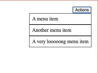
Checkout this codepen demo of anchor positioning with the anchor() function. It shows a button with a menu anchored to its bottom left corner using anchor():
#menu-button {
  anchor-name: --menu-button;
}

#menu {
  position-anchor: --menu-button;
  top: anchor(bottom);
  left: anchor(left);
}
The demo also uses fallback positions to make sure the menu always displays inside the viewport whenever the position of the button changes. You can change the position of the button in the demo by selecting one of the radiobuttons:
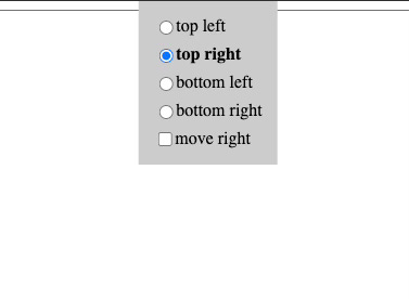
If you select “top right”, the button will move to the (you guessed it…) top right of the screen, and then the menu will be anchored to the bottom right corner of the button to make sure the menu still displays inside the viewport:
The fallback position for this is defined like this:
@position-try --br {
  top: anchor(bottom);
  right: anchor(right);
  left: unset; // <--- oops
}
You can already see a small issue here: since the default position is defined using top and left and this fallback uses top and right, we need to set left to unset.
It’s not a big issue, but it’s not ideal either and a potential source of errors.
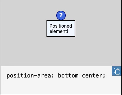
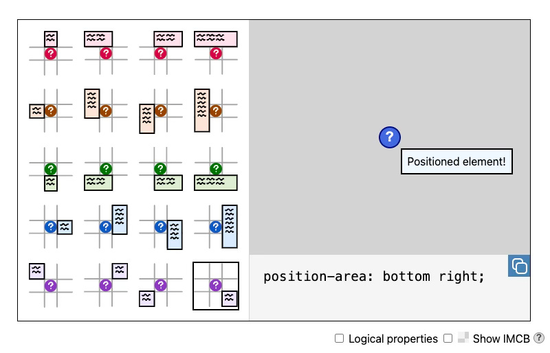
Using position-area, we can define the fallback with a single property and simple keywords. position-area uses an implicit 3x3 grid where the anchor is in the center of the grid.
For example, if you want to position an element centered below its anchor you would use position-area: bottom center:
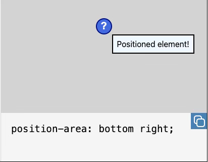
If we want to anchor the menu to the bottom-right corner of the button we would use position-area: bottom span-right:
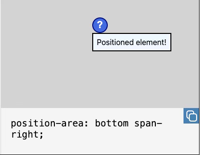
bottom span-right means that the anchored element will be placed in the center of the bottom row and span across the right tiles of the bottom row. This is different from bottom right which results in this:
The best way to learn position-area is through a visualization and the Chrome team has created a great tool to learn about this property. You can find it at https://chrome.dev/anchor-tool/:
Check out the codepen that demonstrates position-area.
TIL: animations don’t work with ::part()
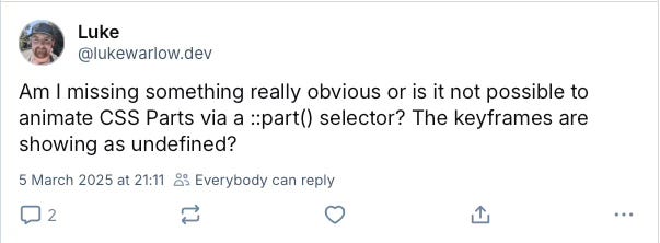
Luke Warlow asked an interesting question on Bluesky this week:
The ::part() pseudo-element is used to style elements inside the Shadow DOM of a custom element (web component). You can think of it as a mixin: you can define a set of rules that can be applied all at once on an element in a shadow root.
You just set the part attribute on an element in a shadow root:
<div part="div"></div>and then you can style that element from outside the web component, for example <test-component>, like this:
test-component::part(div) {
  width: 100px;
  height: 100px;
  background-color: red;
  animation: rotate 1s linear infinite;
}
Now width, height and background-color will work as expected but the animation will not be applied.
The specs don’t mention this but I tested it and indeed the animation won’t work, no matter what I tried. I can imagine that there should be some limitations to this so users can not completely mess up a web component but then I would expect something like display: none not to work either, but it does.
Here’s a codepen that shows this limitation.
I will do some more research on this and write about it here but for now, I just want you to be aware of this limitation.
To be continued…
Book a call with me
Are you struggling with issues in your (progressive) web app or do you need help with implementing certain features?
Whenever you need help, just book a one-hour call with me and I will do my absolute best to answer all your questions and solve your problems.
It's like having me on speed dial whenever you need me
I charge $100 for a one-hour call.
If you're not happy with what I provided you get your money back, no questions asked.

Multiple import maps in Chrome 133
If you’ve already been using import maps you probably noticed that currently, only a single import map is allowed per HTML document. The import map also needs to be loaded before any other module is imported. If any module is imported, further import maps are disallowed.
This makes using import maps fragile in situations where you don’t have full control over the HTML document and it also makes import maps a blocking resource. If you have a single-page app, for example, it would need to load a map of all possible modules that could become quite large.
Chrome 133 now supports multiple import maps which relaxes these restrictions.
Merging of import maps
When Chrome detects multiple import maps it will attempt to merge them into one. When merging, it will make sure that an import map will never override any mappings defined in a map that was loaded earlier, so-called conflicting mappings.
When there are no conflicting mappings in two import maps then their mappings will be merged. So when you have these import maps:
{
  "imports": {
    "foo": "/app/foo"
  }
}
and
{
  "imports": {
    "bar": "/app/bar"
  }
}
The resulting import map will be:
{
  "imports": {
    "foo": "/app/foo",
    "bar": "/app/bar"
  }
}
If two import maps contain conflicting mappings then the mapping that’s part of an import map that was loaded later will be ignored. So this map:
{
  "imports": {
    "foo": "/app/foo"
  }
}
and this one:
{
  "imports": {
    "foo": "/app/bar"
  }
}
will result in:
{
  "imports": {
    "foo": "/app/foo"
  }
}
The same is true for mappings in specific scopes. This map:
{
  "imports": {
    "scopes": {
      "/foo/": {
        "/foo/main": "/foo/main/index.js"
      },
      "/bar/": {
        "/bar/main": "/bar/main/index.js"
      }
    }
  }
}
and:
{
  "imports": {
    "scopes": {
      "/foo/": {
        "/foo/main": "/foo/main/index.js"
      },
      "/bar/": {
        "/bar/main": "/bar/app/main/index.js"
      }
    }
  }
}
will result in:
{
  "imports": {
    "scopes": {
      "/foo/": {
        "/foo/main": "/foo/main/index.js"
      },
      "/bar/": {
        "/bar/main": "/bar/main/index.js"
      }
    }
  }
}
Multiple import maps are still under development so things may change in the future. You can follow these developments in the WHATWG repo at https://github.com/whatwg/html/pull/10528
Bouncy radio buttons with View Transitions
My eye caught a very nice demo of animated radio buttons by Temani Afif where the checked indicator of a group of radio buttons “bounces” from one radio button to another while the selection is moved.
It looks like this:
The demo uses anchor positioning and @property and is currently only supported in Chrome. I was wondering if I could recreate this using View Transitions.
I managed to create a simple version with only a few lines of CSS and a touch of JavaScript where the selected indicator moves in a straight line that looks like this:
Nice! But uhm… aren’t those bouncy radio buttons much more fun?
Well, these can also be implemented using view transitions but require accessing the animations that the browser applies by default when using view transitions. This is something you’ll need sooner or later when working with view transitions so let’s dive in!
Keep reading with a 7-day free trial
Subscribe to Modern Web Weekly to keep reading this post and get 7 days of free access to the full post archives.