

Modern Web Weekly #46
The modern web, tested and explained in plain English

A CSS-only animated dropdown menu with anchor positioning
I recently read the article "Anchor positioning is disruptive" by James Stuckey Weber, which contains a very interesting technique to prevent overlapping anchored elements.
The article describes a demo of a high school yearbook containing photos in a grid with the students' names displayed on the right of the photos.
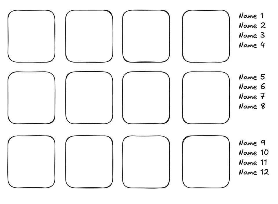
The names are displayed using anchor positioning by anchoring the left side of the photos to the right side of the grid + 1em and the top side of the names to the top side of the corresponding photo.
The photo grid is created with a <ul> element and the photos and corresponding names are inside a <li> element:
<ul>
  <li>
    <img src="photo1.jpg" />
    <h2>Name 1</h2>
  </li>
  <li>
    <img src="photo2.jpg" />
    <h2>Name 2</h2>
  </li>
  ...
</ul>
The CSS for the positioning looks like this:
ul {
  anchor-name: --photos;
}

li {
  anchor-name: --photo;
  anchor-scope: --photo;
}

h2 {
  position: absolute;
  left: calc(anchor(--photos right) + 1em);
  top: anchor(--photo top);
}
Since each <li> element has the same anchor-name (--photo), normally all names would pile up at the last <li> since that is the last element with this anchor-name, but by using anchor-scope, each name will have its own <li> it will be anchored to.
But there is another issue. Since there are usually multiple photos in a single horizontal row and each name will be top-aligned to its photo, the names will overlap each other. Luckily, the article describes an interesting solution that I personally hadn't even thought of and has changed how I look at anchor positioning.
The solution is to give each name (the <h2> elements) an anchor-name as well and then set the top of each name to the greater value of the top of its photo or the bottom of the preceding name:
h2 {
  anchor-name: --title;
  top: max(anchor(--photo top), anchor(--title bottom, 0));
}
This may look a bit strange at first since the <h2> now has anchor-name: --title and uses the anchor() function to align its top to the bottom of the anchor --title so it seems to refer to itself. But this is not the case, it refers to the preceding <h2> that also has anchor-name: --title. A simple but very effective solution.
This makes use of the behaviour that an element that is anchored to another element through anchor-name will always pick the last one in the DOM if multiple elements share that anchor-name.
The nice thing about this approach is that it's completely responsive and enables nice hover effects since the photo and name are in the same <li> but are in different parts of the document. You can check the codepen of the demo.
A CSS dropdown menu using anchor positioning
This opens up a lot of layout possibilities using anchor positioning that go far beyond just anchoring elements together. I was inspired by this and created a CSS-only dropdown menu that opens up like an accordion. This menu also consists of a <ul> element with several <li> elements.
The first <li> functions as the "button" to open the menu. I gave it the anchor-name--first and when the menu is closed, all other <li> elements have their top aligned to the top of this first <li> that also has z-index: 1 so they're hidden behind the first <li>:
/* first li, the "button" to open the menu */
li:first-of-type {
  anchor-name: --first;
  z-index: 1;
}

/* the menu items */
li:not(:first-of-type) {
  position: absolute;
  anchor-name: --li;
  top: anchor(--first top); /* aligned to top of --first */
  transition: top .1s ease-out;
}
The menu items all have anchor-name: --li so when the menu is opened, each one will align its top to the bottom of the preceding <li> and the menu will be opened. I added a transition in the previous example so it opens with an animation:
ul:has(:checked) li:not(:first-of-type) {

  /* top aligned with bottom of preceding li */
  top: anchor(--li bottom);
}
The first demo contained a click event handler to toggle a class on the menu to open it, but since I was going CSS only, I added a hidden checkbox to the first <li> and toggling its :checked state by clicking it will now toggle the menu as well.
I'm not sure if you should use this in production but it's a nice hack, uhm... solution!
Check out the codepen!
Spotify PWA no longer working?
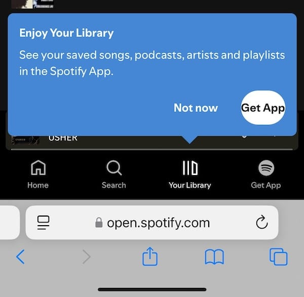
Spotify used to have a nice PWA. Well, they still have it but it no longer works on mobile.
That's right. The web player is still there, but when you open it on a mobile phone, log in, and try to access your library or play music, it sends you to the native app...
But wait, it gets worse...
On desktop, the web player still works. So there's really no technical reason why it shouldn't work in a browser on a mobile device, rather a commercial one. When I open the web player in Chrome on macOS and then also in Safari on iOS, I'm greeted by this dialog:
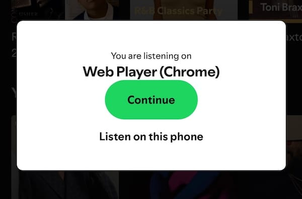
"Great", I thought. Now I can listen to it on my mobile phone.
Nope.
When I click "Continue" and then try to open my library, it sends me to the native app again...
This is not only confusing and unnecessary, it's also really damaging to PWAs. If Spotify can't do it, web apps must be really bad, right?
X and Instagram also have a PWA, I use the X PWA almost daily. These PWAs work perfectly fine, but they don't have offline support and that's really sad.
If three major media companies can't be bothered to implement a well-functioning PWA it reinforces the idea that web apps are inferior to native apps. And that's unnecessary and sad...
Dialog light dismiss in Chrome 134
Chrome 134 will support the closedby attribute on the <dialog> element that determines if and how the <dialog> can be closed, other than with the close() method.
The closedby attribute can have three values:
closerequest: the dialog can be closed with the ESC-keyany: the dialog can be closed with the ESC-key and an outside clicknone: the dialog can only be closed with theclose()method
The none value is the default so it may also be omitted.
A dialog that is closed by a so-called "close request" (ESC-key or outside click) fires a close event right before the close event.
Check this codepen for the details.
PWA Audit: on your way to a great PWA
Do you already have a PWA but are you running into issues with performance, security, or functionality? Or are you not sure how to make your PWA better?
I can help you by running an audit of your PWA
I will evaluate it on more than 35 criteria and provide you with clear and actionable instructions on how to improve it. No generic stuff that you can get anywhere but an in-depth quality checkup to get you on your way to a great PWA.
Some of the criteria I will evaluate it on are:
Installability
Cross-device and cross-platform compatibility
Offline support
Usability
Effective use of modern web APIs
Performance
Security
Your investment in the improvement of your PWA through the audit is $499 excluding VAT (where applicable).
If you want to request an audit or first would like to know more you can
fill out the form or book a call with me.

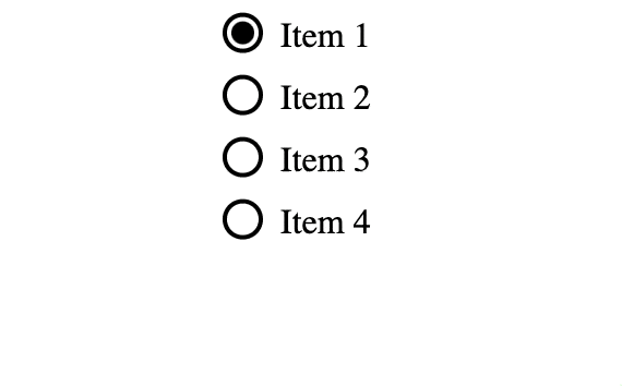
Animated radiobuttons with view transitions
Ok, ok, I know I promised that I wouldn't write about view transitions in this edition of Modern Web Weekly but I couldn't help myself.
Here's a demo of animated radiobuttons using view transitions. Currently, this is not possible with the native appearance of radiobuttons so I used appearance: none which makes the radio button not render anything by default. Then you can use any CSS to style it.
The moving checked indicator of the radiobuttons is a ::before pseudo-element that has a ::view-transition-name. All radiobuttons have a click event handler that calls event.preventDefault() to prevent the clicked radio button from being checked and then the radio button is checked with JavaScript inside a call to document.startViewTransition():
document.querySelectorAll('input[type="radio"]').forEach(radio => {
  radio.addEventListener('click', (event) => {
    // prevent the radio being checked
    event.preventDefault();

    // then check it with JavaScript inside a call to
    // document.startViewTransition so it's animated
    document.startViewTransition(() => {
      radio.checked = true;
    });
  });
});
I'm not sure if you should use this in production but it was a nice experiment!
Coming soon: CSS functions
In Chrome Canary you can now test a prototype implementation of CSS Custom Functions, which means you can now implement your own CSS functions and use them in your CSS! 💪
You can think of custom functions as CSS custom properties that don't hold a fixed value but that take parameters to produce a value. Here's a simple example of a function that adds up three numbers. The result descriptor determines the value that is returned by the function:
Keep reading with a 7-day free trial
Subscribe to Modern Web Weekly to keep reading this post and get 7 days of free access to the full post archives.